
A complex system that works is invariably found to have evolved from a simple system that worked. A complex system designed from scratch never works and cannot be patched up to make it work. You have to start over, beginning with a working simple system.
— John Gall
about design
9
Mar 10
We’re refactoring, thanks!
23
Jun 09
Sneak peek at our new timer
Since we launched Freckle, the number one request from our customers has been:
I want a timer!
Now, there’s a reason Freckle didn’t come with a timer to start with. We didn’t want to build a timer into Freckle for all sorts of reasons: we never manage to use them properly, and even when we remember to start them, we always forget them afterwards. This results in not just a lack of data, but the presence of bad data.
We believed that timers “solve” a problem that is created by bad software to begin with.
But because of your many emails, we’ve come to the conclusion that we were wrong.
Many of you use timers quite effectively, and you’re less forgetful than us. We hear you.
So we’re going to give you, our dearest customer, the best damn timer ever.
Our Plan
We designed a timer that’s just as awesome as our friction-free Quick Entry Box (you know, the thing where you enter your time currently). A timer where you never have to touch your mouse, if you don’t want to; a timer that trusts you to know what you’re doing, and supports you in good habits.
Here are some of the design features of our new timer:
- totally keyboard navigable: to start, stop, pause, and log
- select or switch projects by typing the start of the project name—just like in the QE box (but without a field)
- as few as 2 keystrokes to switch projects
- in-app use or bookmarklet on the go
- resume your timer, in case your browser crashes, you quit your browser accidentally, or you want to switch computers
- auto increment rounding on finish, according to your billing practices
- easy editable time on finish, for those times when you remember that mid-morning coffee break
And there are a few others we’re keeping under wraps.
The Sneak Preview
Keep in mind: it’s not done yet. We know many of you want it yesterday, and so do we, and we’re working our tails off. Unfortunately we can’t give you an exact date yet.
A screenshot:

A quickie video:
<br/><br/>
5
Dec 08
Calamity howlers & positively selecting with surprise
Welcome to Dramatis Commentatis Theater, Act 1.
The crowd is hushed. Four actors in black clothing with black hats stand straight on the darkened stage, head bowed. The spotlight turns to the fellow one from the left. He jerks, suddenly, from quiet stillness to violent motion, ripping off his hat and stomping on it.
OMGZ THE PASSWORD FIELD IS CLEAR TEXT? HOW AM I SUPPOSED TO KNOW THAT IN ADVANCE. GET REAL! YOU MUST BE KIDDIN ME!
The remaining three stir slowly from their own monolithic stillness. They turn their heads this way and that and whisper, almost to themselves. Your ears strain to hear. You’re not entirely sure to believe what your brain is telling you that you’re hearing—they are that quiet.
I liked it.
It’s neat.
Finally.
You reel a little, dizzy from the outburst and from the strain to hear the whispering.
You’ve just experienced the phenomenon of the (near) silent majority and the calamity howlers.
Meet the calamity howlers
A “calamity howler” is a persistently negative individual who predicts rack & ruin, frequently and at the top of his voice. It’s a great term that was especially popular in political writings back in the mid-to-late 1800′s but has since fell out of disuse.
I think this is a real shame and, if this isn’t your first day on the internet, I’m sure you understand why.
Calamity howlers in modern times
Among other, shall we say, strongly negative feedback we’ve received, we had at least one individual telling us we must be “fucking kidding him” because of our clear text password fields on the signup form.
On the subject of clear text credit card fields on the same form (and every other web app), he remained mum.
This man is a great example of a calamity howler. Just like people who tell us that if we only perform an auto-craniorectalectomy on our pricing scheme, he might consider signing up.
There’s just one problem with his theory.
Calamity howlers don’t become customers
And in the rare event that one does pony up money, you’ll soon regret taking it.
Anyone who feels so deeply wronged by a free service is going to feel even more wronged once he has paid for it.
Fake security vs Real security
We’re not going to change the fact that our password fields are clear text by default on signup.
Despite having expletives hurled at us (are expletives ever handed over gently?), and being told more politely that breaking convention is totally pointless.
Why did we even do it in the first place?
A simple reason: We hate the fake security theater surrounding web applications.
Real security is important to us: we keep your credit card data secure by not storing it ourselves—we leave that to the professionals of Authorize.net. They know what they’re doing with that stuff.
But fake security is our enemy. Fake security adds hurdles with no gain. With real security, the extra work is on us, to integrate with the credit card processing service. With fake security, the hurdles are for you, our customer: continuously logging in to applications that hardly contain sensitive nature (delicious, I’m looking at you), starred out password fields on registration that simply increase the chance of errors.
But, still, clear text password fields are not what everybody on the intertubes is trained to expect. Wouldn’t it be easier to just do what everyone else does?
The beauty of positive selection
Well, yes, it’d be easier. I wouldn’t be writing this article, for one. (At least not about this particular topic.)
But down that road madness lies!
People who like freckle like it because it’s different. That’s the reason we like it, too.
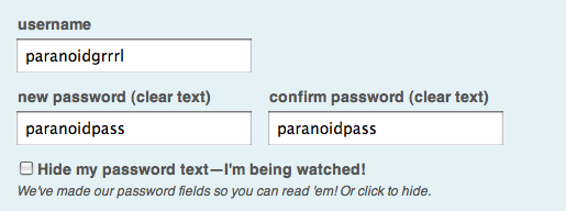
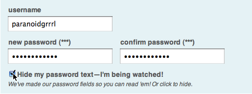
So when you first sign up, within the first few fields, you experience something different. Those password fields. The checkbox that lets you hide your password in case someone really is peeking over your shoulder (or you’re ultra paranoid).
If you’re like us, you hate those damn fake security password fields. And so when you come across our solution, you’ll smile. You might write us a nice little something about it.
You’re probably also going to like the rest of the app, too, because that little password field switcheroo is simply a small manifestation of our entire design philosophy.
If, on the other hand, you react like we just kicked your gramma in the teeth, you’re not going to like the app. It’s going to be one long elderly-face-kicking session for you.
So, sure, we could make the password fields back into what everyone else does to eliminate a part of the signup process that feels like a speed bump to some people. But that’d be almost like lying, wouldn’t it?
It’d be changing one projection of our design philosophy in order to entice people who aren’t going to like the rest of the app.
Folks like that will be happier with some other software in the time tracking space, the kind where you have to use 3 drop-down menus to select your client, then your project, and then your predefined task before you log your time. That will be comforting to them.
Why waste their time? Why waste ours?
We’d rather do what we think is right and let that be a line drawn in the sand for people who aren’t going to agree with us, anyway.
Otherwise we’re just going to have to take up gramma-kicking as a habit.
Do you enjoy a good gramma-kicking and other interface design intrigues? You should [subscribe][http://feeds.feedburner.com/freckletimetracking].